Whether it’s conscious or not, video thumbnails can sway your decision about whether or not to watch a video. For example, despite the old adage, “Don’t judge a book by its cover,” most people do, in fact, judge books by their covers. Thumbnails are the book covers of the digital world. They give you just enough information about what the video might contain to make a split-second decision about whether it’s worth your time.
As a user of the internet, this saves you from having to exert precious mental energy on analyzing all of your content options in detail. But, as a marketer or content creator, it means that the stakes for choosing the right thumbnail image are high. Get it right, and you’ll bring in viewers that are genuinely interested in your content. Get it wrong, and you’ll either miss out on people who would have loved your content, attract people who won’t like your content, or both. Not exactly a recipe for video success.
With that in mind, we looked into the data surrounding video thumbnails. Thumbnails have been around for a while, so there’s no shortage of information online about what typically works and what doesn’t. We saved you from having to dig through all the info by compiling it here for you. Without further ado, here are eight data-driven best practices to keep in mind when you’re selecting a video thumbnail.
Make Sure the Image Represents the Video
First, pick an image or graphic that truly represents the content you’ll cover in the video. Thumbnails are not the time to use a clickbait strategy to try to draw in viewers. Inevitably, those people will land on your video, realize it’s not what they wanted to see, and quickly return to the search page, frustrated that you misled them.
Instead, make the thumbnail relevant to the main point or purpose of the video itself. While you’re at it, make sure the title of your video follows the same premise. As a final check, keep an eye on your watch data. If viewers are consistently watching a few seconds of your video and then leaving, it’s probably an indication that the content you’re sharing isn’t what they were expecting based on the title and thumbnail.
Align Your Thumbnail with the Video Title
Speaking of video titles, choosing your thumbnail gives you an interesting opportunity to build off of the video title. Content creators often assume that any text in the thumbnail should reiterate the title, but that’s not necessarily the case.
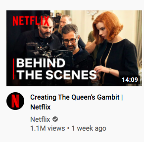
Since viewers will be seeing the title and thumbnail together, you can give them two supporting messages that enhance the effect when they’re together. For example, if your title was, “Video Production Tips to Follow on Shoot Day,” your thumbnail text might say, “8 Expert Tips to Apply
When Filming New Content.” By taking this approach, you get to double down on your point without wasting space by giving the exact same message twice, as you can see in this example from Netflix.
Consider Creating a Custom Image
YouTube’s Creator Academy recommends using a custom-generated thumbnail, not an auto-generated still. After all, YouTube shares that 90% of the best-performing videos on YouTube have custom thumbnails. This makes sense because custom thumbnails give you much more flexibility than you have when choosing from an auto-generated option.
Here are the specs to keep in mind if you’re creating your own thumbnail graphic for YouTube.
- YouTube Thumbnail Dimensions: 1280×720 px (minimum width of 640 px)
- Aspect Ratio: 16:9 (landscape)
- File Format: .JPG / .GIF / .PNG
- Max. File Size: 2MB
Make It Recognizable
Assuming you’re customizing your thumbnail, it’s a great idea to stick to your brand’s typical colors and fonts to create a cohesive look and feel. Alternatively, you can deviate from your standard brand guidelines as long as all of your YouTube thumbnails match.
A lot of content creators skip this step, but aligning the branding of the thumbnails solidifies the connection to your company in the eyes of your audience, which is always a good thing. Next time they’re faced with dozens of similar videos to choose from, they might just pick yours because the thumbnail looks familiar.
HubSpot does this well on its YouTube channel. As you can see in the image below, the thumbnails don’t all follow exactly the same format or structure, but they do use the same colors and fonts so that they’re instantly recognizable.

Use a Close-Up, High-Res Image
Next, let’s take a look at some of the more technical elements of your thumbnail. First, you want to use a high-resolution photo whenever possible. It’s best for the image to also be close-up and for any on-screen text to be large and clearly visible (which often means heavily contrasted from the background).
If you think about the audience experience, this tip makes sense. When users are scrolling through your competitors’ videos, you want to make it especially easy for them to understand your thumbnail. Plus, since so many users are engaging with video content on mobile devices, your thumbnail needs to be clear even on a smaller screen.
Get a Second Opinion
Before you commit to your thumbnail choice, consider getting a second opinion from a friend, family member, or colleague. We’d recommend showing them the thumbnail blind and asking them what they think the video will be about or telling them the video title/concept and asking if the thumbnail aligns.
This can be a great way to gut-check the connection between the thumbnail and the video itself while also giving you an opportunity to catch errors like typos or blurry images.
Consider Your Thumbnail in Advance
Lastly, don’t wait until you’re done capturing content to begin thinking through your thumbnail options. In a perfect world, you’d want to plan your video’s title and thumbnail at the same time you’re planning to shoot the video itself. This allows you to capture photos while you’re shooting that you can use for thumbnail imagery, and it can help you to identify any disconnect between the video concept you’re going for and what actually gets made.
Having everything planned out ahead of time makes it possible to capture all the assets you need at once, and it saves you from the headache of having to piece together a cohesive concept when you’re editing.


