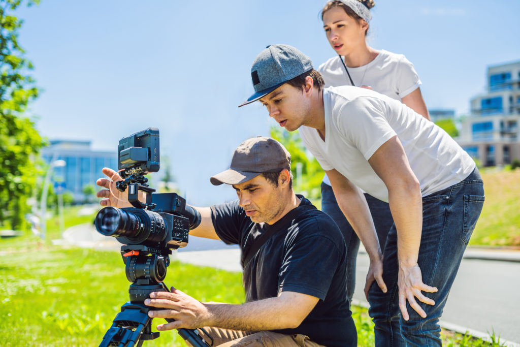
You have probably at some point in your life walked away after watching an inspiring video, episode of TV, or movie in the theater, and been totally blown away by the visuals. Not necessarily by some amazing shot, camera angle, or visual effects, but more by the lighting and the colors used… or the lack thereof.
That’s because the artists who craft the visuals you see on screen are masters of both light and color. Cinematographers, production designers, and even some directors are profoundly aware of how their choices affect the experience of the viewer. There’s even a whole job title called a colorist, which is the person in charge of color correction in post-production.
But when you are creating your own videos, how do you know what colors and lighting to use? How do you even edit the colors of your video in the first place? If you’re making a simple marketing video on your iPhone, do you still need to know all this?
We’ll try to answer those questions with a quick high-level overview of how you can make basic choices in lighting and color, whether it’s using visual filters, actual lens filters, or other methods to create stunning videos like the pros do. Let’s dive in!
The Visual Aspects of Your Image
When shooting a video, whether on digital or actual film, there are some key visual terms you should know in order to understand what you’re looking at and how to change it. These are the qualities and terminology that define the look and feel of the image, not the placement of the camera or the size and style of the lens.
First and foremost, here are a few basic terms about your image and their definitions:
Exposure: The level of brightness of your video. This correlates to how much light is exposed to your camera’s lens when it recorded the shot in question. In order to adjust the exposure of a shot, you can change the exposure and aperture settings on a camera, or edit the exposure digitally in post-production with editing software.
Hue: The color of the light captured in the image. So, for example, if your image is looking up at a shot of trees, the shot will likely have a green hue, maybe with some blue sky coming through.
Saturation: The intensity of the colors present in your shot. You can edit this in post-production, but there’s only so much you can do to adjust this when a film is super over-exposed and washed out, so make sure you get the level of exposure right on-set in order to help you edit your picture quality’s saturation later down the line.
Temperature: As in, the temperature of your video’s color, which refers to the spectrum of colors and light as divided into warm colors (your reds and oranges and yellows) and cool colors (your blues and purples and greens).
Contrast: The ratio, or space between, the brightest part of your video and the darkest part of your video. When the contrast is high, the darks become very dark and the lights become very light, and when the contrast is low, the darks become too faded and the lights become too highlighted. In both scenarios, the middle ground, or space between, becomes muted.
How the Color Processing Process Works
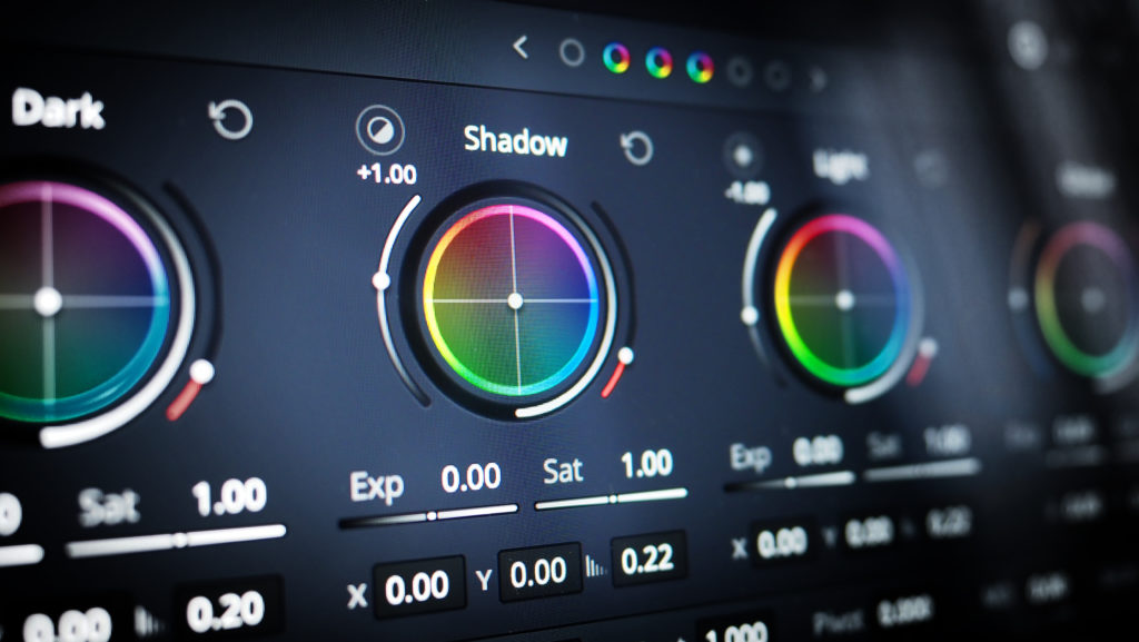
Once you finish shooting your video, you will begin to put together the assembly edit, where you line up all the video clips you want to use on the timeline together. Then you go in and rough cut them all together until you have a version of the finished video. You work on trimming and getting the pacing down until you have a final cut, and once your video is picture locked, then you go ahead and begin to edit the colors in a process called color-correction.
This article is focusing on the color-correction stage, but if you want more information about the other steps, check out our full analysis of post-production.
While you can correct the colors of your video in whatever editing software you are using, you are limited by that program’s internal color tools while doing so. Instead, the pros use a third-party color editing application like DaVinci Resolve which has become an industry-standard over the last decade. While these programs can be tricky to navigate for first-timers, there are plenty of tutorials out there to help you figure it out.
When in doubt, you can send it to a colorist, or full-time color editor, to help you out and color your video for you.
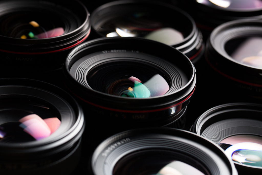
Camera and Lens Filters to Create Colors
If you already know there is a specific color you want to use in your video before you even start, you can use lens filters on your actual camera that have specific colors attached to them. However, you should only use these types of filters if you are absolutely sure you want to use that specific color in your shot. If you change your mind later, there’s only so much you can do to change it, so it’s often a good idea to get a back-up take of any shot using those filters just in case it doesn’t turn out the way you anticipated.
Different Styles of Color Palettes to Use for Your Video
When coloring your video, there are a couple of popular color palette “styles” you can apply to your video’s look and feel.
First, there’s monochromatic coloring, which is where you color your video to favor pretty much one color, like so:
This is a visual choice, and can often be used to stay inside the character’s head, or create a world that looks a certain way for a certain purpose… or just to look cool.
Then there is analogous coloring, where you choose to color your video using colors that sit next to each other on the color wheel. These colors go well with each other but don’t contrast one another, like this:
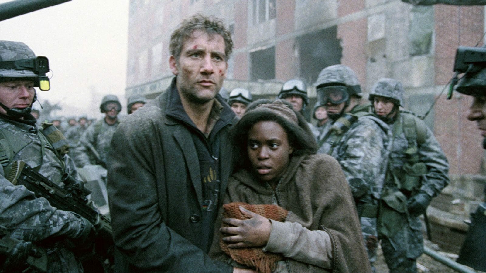
See how there is a dominant color, then a supporting color, and then an accent color that all seem similar? In the example above, it creates a bleak look, which goes well with the source material.
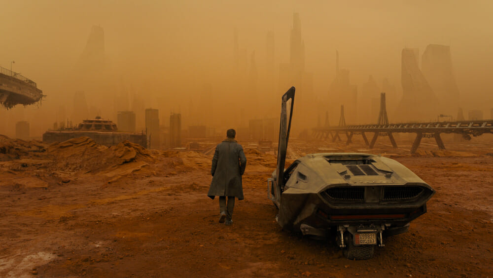
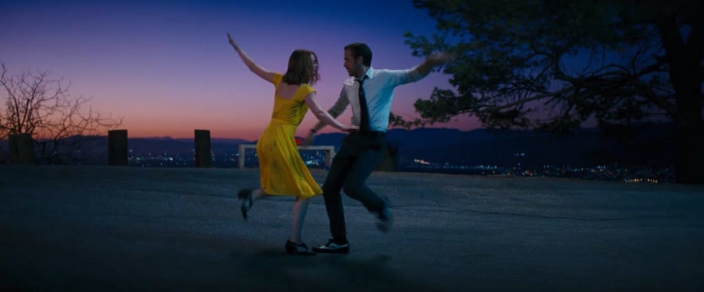
Finally, there is complementary coloring, where you color your video to emphasize two main colors that are opposite of each other on the color wheel, like this:

Because blue and orange are complementary colors, they are often used together in films—particularly action movies like the one above. Another example:
Yellow and purple have the same complementary effect.
Now let’s get into some creative ways to use color to impact your video’s storytelling.
Using Color for Associations
You can highlight certain colors so that they associate with a certain character, object, or theme. For example, if you want to use the color blue to associate with a certain woman in your video, you can edit the coloring so that the blue becomes vibrant and pops out whenever she is on-screen. Then, anytime we see that vibrant blue hue, it’s always associated with her. To pull that off, you should plan ahead in your set and costume design so that those colors will always be in the frame with that character.
In a more marketing-oriented example, you could also turn up the saturation on your product, so every time a shot features your product, its colors are vibrant while the rest of the world around it in the shot is muted.
Using Color for Transitions
You can also use colors to indicate transitions in your story. Let’s say you have a dull and muted world, but then when your product is introduced, suddenly the world becomes full of color and beauty. That would be an example of transitional coloring, where you color the video differently in different parts of it for a narrative story reason.
Normally, color correction is about making all the colors go together to look like one continuous world, but by using a transitional coloring effect, you can indicate important story points with a change in the look of the colors in subtle or obvious ways.
Removing Color Altogether
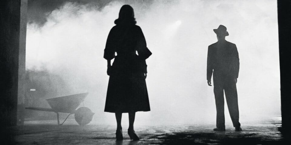
If you so desire, you can also use a filter to mute all of the colors in your video to transform your video into black and white. While black and white is one of the easiest color changes to create in post-production with a simple filter, you should also plan ahead if you are going to use it in your video. Some of the greatest films ever made from the 1930s and 1940s are entirely shot in black and white, and the way the cinematographers in those films (out of necessity, of course) used shadow, light, and the lack of light to create spaces, tonal shifts, and brilliant dramatic sequences is a wonder to behold.
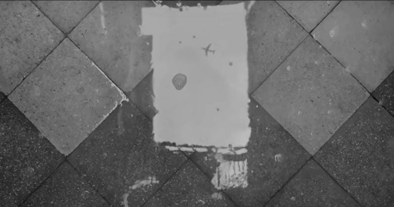
If you are planning on shooting black and white, you should similarly plan ahead in the way that you shoot the movie so it doesn’t just look washed out and bland. Roma, the Alfonso Curan helmed movie that won a handful of Academy Awards, was shot entirely in black and white, but the cinematography was one of the strongest parts of the film, with wide-reaching frames that included incredible visual detail. Some of the most iconic shots in the film include reflections of light through water—even just a simple puddle on the ground.
Creating a storyboard to plan your shots helps to create great visuals in black and white, and to plan your color palette, too.
What to do if this all sounds like too much?
Feeling overwhelmed by all the options? No worries. These are all creative choices that become available to you as you grow in your video production skills and experience. Start by making your videos look good, then you can get into the creative color palettes and such.
Or you can work with the professionals! Schedule a call with one of our producers today and we can walk you through our video process and how we create high quality, affordable videos for you—color included!


